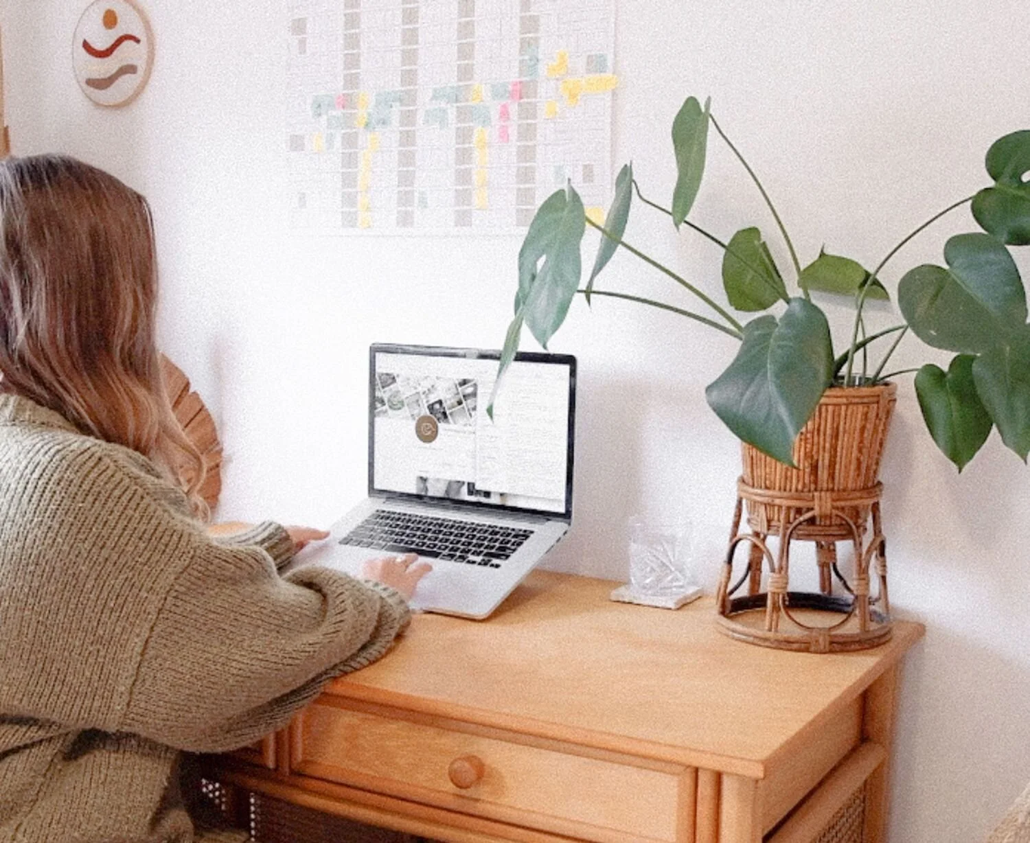
First up, think of Pinterest as more of a creative search engine rather than a regular ‘social media platform’. Its best asset is that people are most likely going there to search for a specific topic. So it’s up to us to help fill in the gaps for them! (This could be recipes, health or fitness programs, business or styling tips or even how to groom your cat — people are on there searching for just about everything)
Read MoreI love working with brands that make a positive impact. Good & Clean’s products not only take care of your body but our planet as well with the use of natural ingredients, plastic free packaging and donations from each purchase going towards ocean conservation
Read MoreSo how do you know when it's time to make the necessary changes to your brand identity? Well if that bottle neck can be resolved by refining how the business is portrayed in the public eye then it's time to sit down and figure out who the business really is and where it's heading.
Read MoreEye catching but not overwhelming and clean but full of character was the aim throughout all the design refreshes and I believe it’s all come together really well in a way that reflects Kate’s vision and attention to detail throughout everything she does with the business.
Read More“the circle represents the community of my brand, the leaf my plant based approach to beauty and the crescent ties in well with the feminine energy and representation of progression, renewal and transition which is also what I’m doing as a brand in the way of transitioning to a natural beauty lifestyle!”
Read MoreIf you work from home and have a dedicated workspace it’s so worthwhile putting in the effort to making it your creative getaway where you know you can just get in the groove and stuck into the endless list of to-do’s.
Read MoreOverall the aim was to keep it minimal and elegant with the use of open space, clean text and simple feminine touches, keeping in mind versatility to seamlessly sit with all the products and services.
Read MoreA beautiful, raw and minimal brand identity designed for Jessica Howard. The colour palette was inspired by the photographer's subjects of rugged landscapes, people and the Australian nature filled lifestyle.
Read MoreAt the end of the day, we find that designing with empathy is what keeps us motivated. It binds our work with a deeper meaning and ensures our designs stay relevant to both our clients and their audiences.
Read MoreOverall this was one of those projects where we were given the freedom to express our creativity all while working towards a goal of giving Steph's branding more relevance and purpose in her business and the chance to utilise its true potential.
Read More


